SHOPEE APP - REDESIGN
This project presents a strategic redesign of Shopee’s buyer interface, reimagining the online shopping experience with a user-first mindset. By combining minimalist aesthetics with smarter navigation, the new design delivers a more intuitive, engaging, and visually cohesive journey that better aligns with user expectations and behaviors.
Overview
This project aims to redesign Shopee’s buyer interface experience with a focus on intuitive navigation, visual minimalism, and user-centered design. By analyzing user frustrations and behavior, the new UX/UI concept offers a simplified and visually refined shopping journey that breaks away from traditional e-commerce clutter.
Key Features
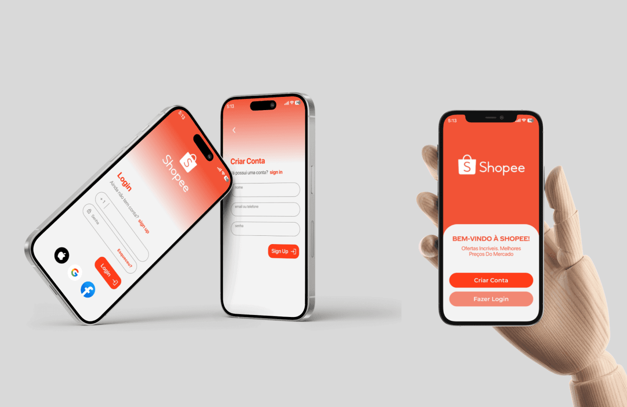
Streamlined onboarding with social login and simplified forms
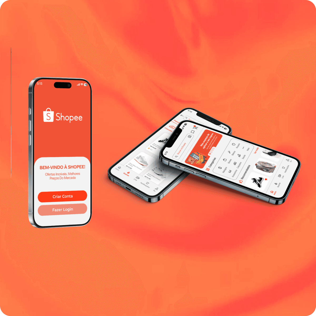
Clear homepage layout with improved category access
Organized, easy-to-use search filters
Modern visual identity with elegant typography and bold red highlights
Simplified bottom navigation with intuitive icons and clear label
Mission
The mission of this project is to elevate Shopee’s buyer experience by creating an interface that is intuitive, visually refined, and centered on user needs. Through strategic UX and UI redesign, the goal is to eliminate friction in the shopping journey—making product discovery, account access, and navigation faster and more enjoyable. This approach not only addresses current user frustrations but also establishes a modern, cohesive identity that strengthens brand perception and user trust across every touchpoint.
Impact
The impact of this redesign lies in its ability to create a smoother, more satisfying shopping experience for Shopee buyers. By simplifying navigation, reducing repetitive actions, and clarifying visual hierarchy, users gain faster access to what they need—leading to increased confidence in the platform and more efficient order tracking. The new visual identity enhances brand recognition while fostering a sense of trust and ease, turning everyday shopping into a more intuitive and enjoyable journey.